Striking Paint Combinations for a Harmonious Living Room
The living room often serves as the focal point of a home, a space for relaxation, entertainment, and social interaction. The selection of paint colors for this area significantly impacts the overall ambiance and aesthetic appeal. Thoughtful color combinations can transform a drab living room into a welcoming and visually stimulating environment. Achieving the desired effect hinges on understanding color theory, considering the room's natural lighting, architectural features, and personal style preferences.
Selecting a paint palette involves more than simply picking favorite colors. It requires considering the interplay between hues, their intensity, and their potential to evoke specific moods. A well-chosen paint combination can visually expand a small living room, create a cozy atmosphere in a large space, or highlight architectural details. Furthermore, understanding the psychological effects of colors allows homeowners to curate a living space that aligns with their desired emotional response.
Understanding the Foundation: Primary, Secondary, and Tertiary Colors
The foundation of color selection lies in comprehending the primary, secondary, and tertiary color relationships. Primary colors—red, yellow, and blue—are the building blocks from which all other colors are derived. Mixing these primary colors creates secondary colors: green (blue and yellow), orange (red and yellow), and purple (red and blue). Tertiary colors are formed by mixing a primary color with a neighboring secondary color, resulting in hues such as red-orange, yellow-orange, yellow-green, blue-green, blue-violet, and red-violet.
These color relationships are often depicted in a color wheel, a visual tool that illustrates the connections between different hues. Understanding the color wheel provides a framework for creating harmonious color combinations. Complementary colors, located opposite each other on the wheel (e.g., red and green, blue and orange), create a vibrant contrast. Analogous colors, situated next to each other (e.g., blue, blue-green, and green), offer a more serene and cohesive palette. Triadic color schemes, using three colors equally spaced on the wheel (e.g., red, yellow, and blue), provide a balanced and dynamic look. Using the color wheel as a reference allows for informed decisions regarding color pairings, ensuring visual harmony and preventing clashing color schemes.
Neutral colors, such as white, gray, beige, and black, also play a crucial role in interior design. While not present on the traditional color wheel, these hues provide a backdrop against which other colors can shine. Neutral tones can be used to create a sense of calm and sophistication, while also highlighting the vibrancy of accent colors. The strategic use of neutrals is essential for balancing a color scheme and creating a visually appealing space.
Considering Natural Light and Room Orientation
The amount and type of natural light a living room receives significantly impacts how paint colors appear. Rooms with ample natural light can handle bolder, deeper colors without feeling overly dark or closed in. In contrast, rooms with limited natural light benefit from lighter, brighter colors that reflect light and create a sense of spaciousness.
The orientation of the living room also influences color perception. South-facing rooms tend to receive warm, yellow-toned light throughout the day. This allows for greater flexibility in color selection, as most colors will appear true to their swatch. North-facing rooms, on the other hand, often receive cooler, blue-toned light. Warmer paint colors, such as yellows, oranges, and reds, can help to counteract the cool light and create a more inviting atmosphere in these rooms. East-facing rooms receive warm morning light and cooler afternoon light, while west-facing rooms experience the opposite. Considering these lighting nuances when selecting paint colors is crucial for achieving the desired effect throughout the day.
Furthermore, the finish of the paint also affects light reflection. Glossier finishes reflect more light, making them suitable for highlighting architectural details or creating a more vibrant look. Matte finishes absorb more light, creating a softer, more muted appearance. The selection of paint finish should align with the desired aesthetic and the functional requirements of the space.
Popular and Effective Paint Color Combinations
Numerous paint color combinations can be employed to create a stunning living room. The choice ultimately depends on personal preferences and the desired atmosphere. However, some combinations consistently prove to be effective and visually appealing.
Gray and White: This classic combination offers a sophisticated and versatile backdrop for any style of décor. Gray provides a neutral base, while white accents create contrast and brightness. This pairing can be adapted to various shades of gray, from light and airy to dark and dramatic. Adding pops of color through accessories and artwork can further personalize the space.
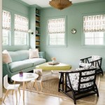
Blue and Gray: Blue is known for its calming and serene qualities, making it an excellent choice for a living room. Combining blue with gray creates a harmonious and relaxing atmosphere. Lighter shades of blue, such as powder blue or sky blue, work well in smaller spaces, while darker shades, such as navy blue or charcoal gray, can create a more dramatic effect in larger rooms. Accents of white or silver can further enhance the sophistication of this palette.
Green and Beige: This nature-inspired combination brings a sense of freshness and tranquility to the living room. Green evokes feelings of growth and renewal, while beige provides a warm and neutral backdrop. Lighter shades of green, such as sage green or mint green, are ideal for creating a calming atmosphere, while darker shades, such as emerald green or forest green, can add a touch of drama. Accents of natural wood and plants can further enhance the organic feel of this palette.
Yellow and Gray: This cheerful combination brings a sense of energy and optimism to the living room. Yellow is a vibrant and uplifting color, while gray provides a grounding and sophisticated counterpoint. Using a muted yellow, such as pale yellow or mustard yellow, can prevent the space from feeling overwhelming. Accents of white or black can further balance the palette and create a cohesive look.
Beige and White: This timeless combination creates a warm and inviting atmosphere in the living room. Beige is a versatile neutral that complements a wide range of furniture styles and décor. Combining beige with white creates a clean and classic look. Introducing texture through fabrics and rugs can add depth and interest to this neutral palette.
Monochromatic Schemes: Utilizing different shades of the same color is another effective approach. For example, various shades of blue, from light sky blue to deep navy, can create a sense of depth and dimension. This approach works well with any color but requires careful attention to texture and variation to avoid monotony.
Accent Walls and Strategic Color Placement
An accent wall offers an opportunity to introduce a bold color or pattern without overwhelming the entire room. The selection of the accent wall is crucial; typically, the wall that naturally draws the eye or features a unique architectural element is the most effective choice. This could be the wall behind the sofa, the wall with a fireplace, or a wall with a large window.
When selecting a color for the accent wall, consider the overall color scheme of the room. A complementary color can create a striking contrast, while an analogous color can offer a more subtle and harmonious effect. The intensity of the accent color should also be considered. A deeper, more saturated color can create a dramatic focal point, while a lighter, more muted color can add a touch of personality without dominating the space.
Strategic color placement extends beyond accent walls. Painting the ceiling a lighter shade than the walls can visually raise the ceiling, making the room feel more spacious. Conversely, painting the ceiling a darker shade can create a more intimate and cozy atmosphere. Using color to highlight architectural details, such as crown molding or baseboards, can also enhance the overall aesthetic appeal of the living room.
Incorporating color through accessories, such as throw pillows, rugs, artwork, and curtains, allows for flexibility and personalization. These elements can be easily changed to update the look of the room without requiring a full repaint. Selecting accessories in complementary or analogous colors can further enhance the overall color scheme.
Ultimately, the best paint color combinations for a living room are those that reflect personal style and create the desired atmosphere. Experimenting with different color palettes and considering the factors discussed above can help homeowners create a living space that is both beautiful and functional.

11 Cozy Living Room Color Schemes To Make Harmony In Your

The Best Neutral Paint Colors For Every Room Colorfully Behr

7 Popular Paint Colors For The Living Room

30 Living Room Paint Colours Inspiration For An Inviting Space Beamin Moore

The Best Living Room Paint Colors According To Designers

The 10 Most Elegant Colors For Walls Decoholic

Living Room Paint Colors Ideas The Home

74 Best Living Room Paint Color Ideas For 2025
.jpg?strip=all "Two New Living Room Paint Colors Dream Green Diy")
Two New Living Room Paint Colors Dream Green Diy

These Two Living Room Colors Are The Perfect Combo Clare