Interior Color Design For Living Room
The living room, often considered the heart of the home, serves as a central hub for relaxation, entertainment, and social interaction. Its interior color design plays a pivotal role in establishing the room's overall ambiance, reflecting the homeowner's personality, and influencing the mood of its occupants. Thoughtful consideration of color palettes, textures, and lighting is crucial in creating a living room that is both aesthetically pleasing and functionally supportive of its intended uses.
Choosing the right colors for a living room involves a multifaceted approach, taking into account factors such as the room's size, natural light exposure, existing architectural features, and the desired atmosphere. Color psychology, an understanding of how colors impact human emotions, is a valuable tool in this process. For example, warm colors like reds, oranges, and yellows tend to evoke feelings of energy, excitement, and sociability, making them suitable for lively and engaging spaces. Conversely, cool colors such as blues, greens, and purples are often associated with calmness, tranquility, and serenity, ideal for creating a relaxing and peaceful retreat. Neutral colors like whites, grays, and beiges provide a versatile backdrop, allowing for the incorporation of bolder accent colors and decorative elements.
Beyond individual color choices, the way these colors are combined and balanced is equally important. A well-designed color scheme typically incorporates three primary elements: a dominant color that covers the majority of the space, a secondary color that complements the dominant color and adds visual interest, and an accent color that provides pops of vibrancy and draws the eye to specific focal points. The application of the 60-30-10 rule, where the dominant color covers 60% of the room, the secondary color 30%, and the accent color 10%, is a common strategy for achieving a harmonious and balanced color scheme.
Understanding Color Psychology and Its Application
Color psychology delves into the influence of colors on human emotions and behaviors. The conscious and subconscious reactions to different hues can significantly affect the atmosphere and functionality of a living space. By understanding these associations, homeowners and designers can intentionally select colors to evoke specific feelings and create the desired ambiance. For example, a living room intended for frequent social gatherings might benefit from warm colors known to stimulate conversation and energy.
Red, often associated with passion, excitement, and energy, can be a powerful accent color in a living room. However, it is often recommended to use it sparingly as excessive use can be overwhelming. Orange, a more approachable and cheerful color, combines the energy of red with the optimism of yellow. It can create a warm and inviting atmosphere, stimulating creativity and communication. Yellow, known for its association with happiness, optimism, and intellect, is best used in moderation, as too much yellow can be stimulating and even induce anxiety in some individuals.
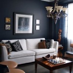
Cool colors, such as blue and green, offer a different set of emotional impacts. Blue, often associated with tranquility, peace, and stability, is a popular choice for creating a calming and relaxing environment. Lighter shades of blue can create a sense of spaciousness, while darker blues can add a sophisticated and grounding feel. Green, representing nature, growth, and harmony, is a versatile color that promotes balance and well-being. It can be used effectively in a variety of living room styles, from traditional to modern.
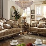
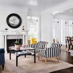
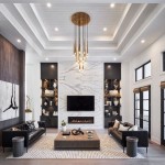
Purple, a combination of red and blue, is often associated with royalty, luxury, and creativity. Lighter shades of purple, such as lavender, can create a calming and elegant atmosphere, while darker shades, such as eggplant, can add a touch of drama and sophistication. Neutrals, including white, gray, and beige, provide a blank canvas that allows for the incorporation of other colors and textures, creating a balanced and versatile design. White offers a sense of purity, spaciousness, and light, while gray provides a sophisticated and neutral backdrop. Beige, a warm neutral, can create a cozy and inviting atmosphere.
Factors Influencing Color Choice: Light, Size, and Architectural Features
The selection of colors for a living room should not be solely based on personal preferences. Several factors related to the physical aspects of the room itself play crucial roles in determining the most effective color palette. These factors include the amount of natural light the room receives, the size of the room, and the existing architectural features that are already in place.
Natural light has a significant impact on how colors appear within a space. A living room with ample natural light can handle bolder and darker colors without feeling cramped or oppressive. Conversely, a room with limited natural light may benefit from lighter and brighter colors to maximize the sense of spaciousness and luminosity. Consider the direction the windows face. South-facing rooms receive warm light throughout the day, while north-facing rooms receive cooler, indirect light. This difference in light quality will influence how colors are perceived and should be taken into account when choosing a color scheme.
The size of the living room is another important consideration. Light colors tend to make a room feel larger and more open, while dark colors can make a room feel smaller and more intimate. In a small living room, it is generally advisable to use lighter colors on the walls and ceilings to create a sense of spaciousness. However, dark accent colors can be used strategically to add depth and visual interest. In a larger living room, the options are more varied. Homeowners can experiment with bolder colors and patterns to create a more dramatic and impactful space.
Existing architectural features, such as fireplaces, moldings, and built-in bookshelves, can also influence the color choices. These features can be highlighted with contrasting colors or blended seamlessly with the overall color scheme. For example, a fireplace can be painted a darker color to make it a focal point, or it can be painted the same color as the walls to create a more cohesive look. Similarly, moldings can be painted a contrasting color to add architectural detail, or they can be painted the same color as the walls to create a more subtle effect. The style of the architecture should also influence color choices. Traditional architecture may benefit from classic color combinations, while modern architecture may lend itself to bolder and more contemporary color palettes.
Strategies for Creating Cohesive and Balanced Color Schemes
Once the foundational understanding of color psychology and the influencing factors are established, the next step is creating a cohesive and balanced color scheme for the living room. This involves selecting a palette of colors that work harmoniously together and applying them strategically throughout the space. Several strategies can assist in achieving this goal.
The 60-30-10 rule, previously mentioned, is a practical guideline for creating a balanced color scheme. This rule suggests that 60% of the room should be the dominant color, 30% should be the secondary color, and 10% should be the accent color. The dominant color typically appears on the walls, the secondary color on larger furniture pieces like sofas and chairs, and the accent color on accessories such as pillows, artwork, and rugs. This rule helps to create a visual hierarchy and prevents any one color from overpowering the space.
Another useful strategy is to use a color wheel to identify complementary, analogous, or triadic color schemes. Complementary colors are located opposite each other on the color wheel, such as blue and orange, and create a dynamic and vibrant contrast. Analogous colors are located next to each other on the color wheel, such as blue, blue-green, and green, and create a harmonious and calming effect. Triadic colors are three colors that are equally spaced apart on the color wheel, such as red, yellow, and blue, and create a balanced and playful effect. Choosing a color scheme based on these relationships can help to ensure that the colors work well together.
Using color variations within a single hue can also create a sophisticated and layered look. This involves using different shades, tints, and tones of the same color throughout the room. For example, a living room could feature a light blue wall color, a medium blue sofa, and dark blue accent pillows. This approach creates a sense of depth and visual interest while maintaining a cohesive and harmonious feel. Consider the use of textures to further enhance the color scheme. Incorporating different textures, such as velvet, linen, and wood, can add depth and dimension to the space and create a more tactile and engaging experience. Finally, it is essential to test colors in the actual living room before committing to a final decision. Paint samples on different walls and observe how they look at different times of day and under different lighting conditions. This will help to ensure that the chosen colors are truly the best fit for the space.

Living Room Color Ideas Transform Your Project Alma De Luce

30 Living Room Color Ideas Best Paint Decor Colors For Rooms

5 Neutral Living Room Paint Color Ideas Design Cafe

30 Living Room Paint Colors Inspiration For An Inviting Space Beamin Moore Wall Color Schemes Earth Tone

7 Charming Wall Painting Ideas For Living Room Design Cafe

You Ll See These Interior Paint Colors Everywhere In 2024

Blue Living Room Design Ideas For Your Home Designcafe

9 Amazing Living Room Paint Ideas For An Affordable Makeover Décor Aid

2024 Living Room Paint Color Trends

50 Popular Living Room Colors Paint Ideas